Real Simple Magazine Features Jessica Poundstone's Artwork!

Exciting news: the May 2020 issue of Real Simple magazine featured my piece “Keep Going 1” in the article “Let’s Hang!” written by Stephanie Sisco and Leslie Corona, and photographed by Bryan Gardner. (The online version of the article is titled 4 Smart Strategies for Creating a Stylish Gallery Wall.)

That’s the short version of the story :)

Image from the article “Let’s Hang! 4 Smart Strategies for Creating a Stylish Gallery Wall” in the May 2020 issue of Real Simple Magazine, photography by Bryan Gardner

Image from the article “Let’s Hang! 4 Smart Strategies for Creating a Stylish Gallery Wall” in the May 2020 issue of Real Simple Magazine, photography by Bryan Gardner

The long version is that I had no idea this was happening and I bought this issue of Real Simple somewhat randomly and had it in my house for over a week before I opened it! I wanted to wait until I could really enjoy it, which turned out to be during some late-night-me-time: everyone else in my family was asleep.

When I got to the story on buying and hanging art I was like oh cool they got some of these pieces from Artfully Walls, which is a great website I’ve worked with for a few years now. And I was looking closely at the pieces featured on the first page of the story and mentally congratulating people.

Then I turned to page two of the story and BOOM: there it was in the fricking center of the gallery wall, my piece Keep Going 1! My jaw fell open, my heart started racing, and I just sat there and stared at it for a few beats.

Then I ran into the bedroom and woke my husband up so I could a) validate that this was not a hallucination and b) freak the flip out with another human.

When I woke up the next morning I had to look at it again to make sure it was still there. It was ;) I am still in a cloud of joy and excitement over this whole thing.

Keep Going 1 is available at Artfully Walls or here on my website, where you can also find the other pieces in the series, Keep Going 2 & Keep Going 3.

Thanks so much to all of the folks at Real Simple that made this awesome article happen!

Natalie Myers of Veneer Designs Calls My Work "Amazingly Meditative"!

The incredible designer Natalie Myers of Veneer Designs is now the proud owner of “Color Cloud 16: You Never Know”! It’s hanging in the den of her LA home, and I am so super stoked at how beautifully it fits into her organic modern “Scandifornia” vibe.

natalie-myers-veneer-designs-jessica-poundstone-color-cloud-den.jpg


Here’s what Natalie had to say in her Instagram post about the piece:

“The walls we are staring at every day really do impact us, huh? Art makes a huge difference for me in changing my attitude. I fell in love with @jessicapoundstone abstracts and she rushed her printer to get this one out the door before their shop was shut down. I’m so glad she did because even though this print is meant for Ilana’s room that’s getting a makeover soon, it’s currently hanging in my favorite sunny spot of the den. I can stare at it and let my imagination take me elsewhere. It’s an amazingly meditative work and a meaningful souvenir of this time. When the quarantine is over it will move to Ilana’s room and live its best life, but for the time being it’s here to soothe all of us.”

Check out Natalie’s amazing work - and snag a piece that speaks to you from the Color Cloud series right here!

Zach Tutor of Supersonic, New Contemporary Art Calls My Work "Astoundingly Wonderful"!

Zach Tutor, curator of Supersonic, New Contemporary Art - which SF Weekly called, "So refreshing and expansive it could kind of knock you out” - kindly featured my work on his site, calling it “astoundingly wonderful” which is really just very very over the top of him. See his favorites at this link!

Color Cloud 11: You Make the Weather is available for purchase here

Color Cloud 11: You Make the Weather is available for purchase here

Here’s a bit more about what Zach’s up to: “Supersonic’s sole purpose, through sharing and discussion, is to chronicle the School of New Contemporary Art: A generation of creatives who have had access to infinite aesthetic inspiration via the Internet and other electronic devices…..Zach personally likes to refer to this movement as 'Deep Pop.’”

Follow Zach’s curation on Supersonic’s website and @supersonicart on Instagram!

My Interview on the Rare Device Website

The amazing humans over at Rare Device just re-launched their website, and you should most definitely check it out. It made me remember the amazing interview Kayla Conyer did with me there earlier this year - I wanted to add the full text here as well, because I loved her questions, and I hope the answers will be interesting to you as well, whoever you are ;) Here’s a link to the original version on the Rare Device site.


Inspired by feelings and concepts, the work of Jessica Poundstone has captivated the Rare Device staff. Jessica’s color block prints evoke the spirit of well-known artists like Mark Rothko or Josef Albers. Based in Portland, Oregon, Jessica began creating digital artwork over the last few years using only her hands and an iPad. Without any formal art training, her part-time practice is increasingly becoming a bigger part of her life. We talked to Jessica about where she finds inspiration, how she finds time to create art, and how color plays a large role in all of her pieces.

KC: How long have you been creating art and what is your background? At what point did you decide that making art and putting it out into the world is something you wanted to pursue?

JP: I started making art when I was a kid and never really stopped. I didn’t go to art school — I got a degree in Humanities with a minor in writing and have worked in communications ever since. But I’ve always spent a pretty significant amount of my time looking at, thinking about, and making pictures.

It was about two years ago that something shifted for me in terms of my art: I wanted to publish the pictures I was making and felt a strong urge to just go for it. It felt less like a decision and more like a compulsion, honestly. So I started an Instagram account and just went for it. I can’t even tell you how encouraging those very first likes and comments were! The intensity of my drive to make and put my work out there hasn’t diminished much since then. I am still so energized by creating new work and exploring new ways of thinking visually.

KC: Your work is mainly digital, but so many of your pieces remind me of paintings. How did you decide to stick with digital media over more traditional practices?

JP: Over the years, I’ve tried out a lot of different mediums. Pencil, charcoal, watercolor, acrylics, gouache, screen printing, ceramics: you name it, I’ve probably tried it. But none of the mediums I explored felt like “home” to me. I had messed around with making images on my phone in the painting app Brushes (much like a simplified Adobe Illustrator, it’s a blank-canvas painting app) for a while. But I hadn’t thought of it as a primary medium I could work in until I read that David Hockney had been making work on his phone and later on his iPad (also in the Brushes app). Just hearing him say how much he liked it — and then seeing pictures of a museum show of his where they displayed his iPad images on large LCD screens — made it an intriguing possibility I felt liberated to explore.

Over several months, I experimented with making images on my phone — often during my bus ride to and from work. I created a few different techniques and processes for making minimalist pictures that I absolutely loved. The images felt like a pure expression of things I wanted to say; it felt like I had finally found my voice.

Very quickly, though, I realized that I needed to know how these images would look in print. If they were not successful I’d need to figure out a way of working them in analog because I was now committed to the style I’d developed. I did a ton of research, found a local giclée printer and sent off some files. I was absolutely overjoyed when the test prints came back looking exactly like they looked on my screen. That’s when I knew for sure that I could continue working in digital.

Me at my dining room table….er, I mean studio :)

Me at my dining room table….er, I mean studio :)

KC: What is your practice like? Do you work as a full-time artist, or is creating art something you find yourself having to make time for?

JP: I have a pretty demanding full-time job, as well as family life and social life to tend to, so...yeah it’s a balancing act. There are days I find myself wishing I could work on art full time —  on other days I’m glad it still feels like I’m “stealing time” to make art because that dynamic creates a certain joyful/focused energy that makes it into the work. I’ve always been a night person, so I’m often working on my art after everyone else in my family has gone to bed, between 10 p.m. and 1 a.m.

KC: What is your process for developing your work? Do you start with color, pattern, or nothing at all?

JP: I have a lot of different starting points because I am constantly getting excited by things I encounter (an article I read, artwork I see, a building I drive by, etc. etc.) and generally have way more ideas than time to execute them! Sometimes I start with a color or a color combination; other times it’s something I’ve heard or seen, or there’s a feeling or concept I want to explore. No matter the starting point, I try to let the work lead me wherever it wants to go. That’s one of the many ways digital is so freeing — I can try anything with an image and never have to worry about finding a space to work or spending money on materials. I didn’t realize how much those two factors limited my process until I no longer had to worry about them.


KC: With the exception of a few pieces that are nature-based, most of your work is very abstract. Are these forms based on real items, places, and scenarios, or are they spontaneously drawn from the unconscious?

JP: It was a big shift — and a big relief — to step away from making representational work. And yes, most of my work is coming from the unconscious and is done in “flow” — as in the Mihály Csíkszentmihályi definition of it: that state where you’re completely absorbed in and energized by the work you’re doing because you’re being challenged at the top of your ability. It’s an incredibly exciting feeling.

KC: Color is obviously a point of interest for you. What are you looking for in the connection of multiple colors on a surface? Do you want to evoke a feeling? Spark interest?

JP: Color is just such a huge gift and a mystery. It’s very much like music to me. I’m still wowed by it all the time. At the heart of it, I think what I’m trying to create with these images are beautiful, meditative spaces people can have and hold in their minds. I want them to be both a catalyst and a comfort — a way of helping people break out of habitual thought patterns, inspiring new possibilities, new ideas and new ways of thinking and feeling.

KC: Are there certain color combinations that you find yourself going back to time and time again? Do they have any personal relevance to you?

JP: I was recently cataloging my work and realized I definitely do have some colors I go back to again and again — although I couldn’t really say why, or whether there’s personal relevance there. The main one is a soft, slightly orangey pink — I’ve been really close to that color for many years, and I see that I pair it with midnight blue, egg yolk yellow and bright tomato red in a recurring way.

Color Space 3

Color Space 3

KC: Do you have any projects or “dream pieces” that you’re hoping to work on/create in 2019?

JP: A crazy dream I’ve had for a long time (who knows, maybe this is the year!) is to make a light bath — a portable chamber people could step into and be in for a while to really experience a certain color or colors. In my vision, I’d buy time in various parking spots around town and people could come and just be engulfed by the color of their choice for a chunk of time. Doesn’t that sound great? If you can help make that happen, get in touch :) A more practical “dream” is to explore some surface design applications for my work — I have so many ideas for patterns! — and possibly make some work that’s really, really big.

Founders of Interior Design Firm Tilton Fenwick Feature Two of My Pieces In Their Chairish Picks

Tilton Fenwick is a legendary New York-based design firm founded by Anne Maxwell Foster and Suysel dePedro Cunningham. The pair recently combed through the treasure trove that is Chairish and picked their favorites — including two of my pieces: Color Space 27 and Pink Zig Zags: Soft Geometry! (Shop all their picks here.)

In a related article on the Chairish blog, “Playing Favorites With TIlton Fenwick” the pair shared their love for finding art treasures on Chairish: “…there are so many artwork options to add that final layer to a room!”

Maxwell Foster and Suysel dePedro Cunningham also shared one of their favorite quotes, from Rumi: “Light your life on fire. Surround yourself with those who fan your flames.” Love it, love their style, and love being included in their world of design. Thanks to everyone who made the feature happen!

Gallery Wall Ideas From the Artfully Walls Team

Artfully Walls has used my work in several recent features sharing fun ideas for gallery walls. Take a look and click through to learn more!

This super fun grouping of images, “Emmy Style,” was inspired by the pink + red dresses at this year’s awards. Two of my pieces are included shown here on the on the bottom row: Color Books 3, Scarlet, Pink & Gold and the ever-popular Color Space 27, Pink, Red, Yellow.

And last but not least, the Perfectly Pink gallery features my piece Soft Geometry: Pink Structure (Give Yourself the Softest Landings). “The team suggests these be placed together in a “writing den, powder room or a budoir” - three places I would love to have available to me ;)

Go check out all of the goodness at Artfully Walls! And of course you’re also free to order any of these pieces through me right here.

Roxane Gay, Jane Eaton Hamilton & Jessica Poundstone (Wut!?!)

Do you know Roxane Gay?

If not, you should get to know her because she is an amazing human who - in addition to being a professor and a writer and a NYT op-ed columnist and a bunch of other cool s*** - has also started a magazine on Medium called Gay Magazine, which is “dedicated to diverse, intelligently provocative work” and “interested in deep explorations, timelessness, and challenging conventional thinking without being cheap and lazy.”

Thrillingly, they have selected six of my pieces to serve as illustrations for an article by the wonderful Jane Eaton Hamilton called “The Pleasure Scale” and I’m so thrilled and honored.

Go learn more about Roxane, Gay Magazine and Jane Eaton Hamilton.


Featured Artist in "Friends With Benefits"

Pleat Gallery (where I was lucky enough to have had a show in August 2018) founder Bethanie Irons called her thesis show “Friends With Benefits,” exploring the ways that artists interact with Instagram. I’m proud to be among the artists featured in it!

My contribution is on the right, below - here’s my feeling about Instagram at this moment in time: “Through Instagram I am interacting with art and artists every day and showing my work regularly. It inspires me to trust my aesthetic instincts and to keep exploring new ways of seeing, thinking and working.”

Image from Bethanie Irons Instagram account - view image here.

Image from Bethanie Irons Instagram account - view image here.

Learn more about the show on Bethanie’s website - and be sure to keep up with the wonderful Pleat Gallery!

Image from Bethanie Irons website - see more images of the show here.

Image from Bethanie Irons website - see more images of the show here.


My Work Now Available at Rare Device in San Francisco + An Interview on the Rare Device Blog!

Excited to share that Rare Device in San Francisco is now carrying my work!  If you don’t know about this shop, you should - I’ve followed its story since it started up way back in the day in Brooklyn, then moved to SF. Rena Tom founded it, then Lisa Congdon became a co-owner, and now it’s under the care and leadership of Giselle Gyalzen with Creative Manager  Rachel Robertson and a whole bunch of other amazing folks

From the Rare Device website: “The storefront is filled with lovely, approachably designed items for your home, yourself, and your family. Every object in the store has its own story, and has been chosen because it is either handmade, well-designed, useful, beautiful or all of the above. The aesthetic is modern and whimsical while remaining warm and inviting.” All extremely true: I love this spot in the world, so this is a bit of a dreams-do-come-true moment for me :)

In addition to carrying several of my prints (if you’re in San Francisco, go see ‘em!) they were also kind enough to publish an interview with me on their blog, which you can read right here. (Thanks again for the awesome Qs Kayla Conyer!

Recent News + A Giveaway!

A lot has happened with my work in the past few months, and I’ve not been very good about keeping up here! Highlight reel:

  • I’m in a group show called Transform, put on by Siren Nation. The opening reception is Thursday November 1 (details here) - if you’re in Portland, come on out and say hello!

  • Kinetic Lines 17 was chosen to hang in designer, blogger & tv personality Emily Henderson's "Portland Project" showcase home, which was extremely cool!

  • I’m a member of the Chairish Artist Collective, and was proud to be featured in Chairish curators’ "Essential Trends of 2018" collection!

  • My work was featured by Saatchi Art in a collection!

  • Artfully Walls showcased my work in a number of different featured collections - always very fun to see curated gallery walls and how my work fits in!

So lots of cool stuff going on. To celebrate (and also let’s be honest, the scene in this country at the moment is deeply disturbing and I’d love to create a little light in the way I can.)

Head on over to my Instagram page and throw your hat in the ring. Good luck!

Color Space 27 Featured by SFMOMA Curators!

Each Friday, the team at the San Francisco Museum of Modern Art (SFMOMA) features a few pieces made by working artists on their Instagram & Tumblr accounts. I'm thrilled to share that Color Space 27: Pink, Red & Yellow was the cover image for their weekly feature a couple of weeks back! (Right there next to Magritte....squeeee!!!). 

So honored and thrilled - and inspired to keep following my aesthetic and keep doing the work. And if you're a working artist, throw your hat in the ring to be featured! It's an amazing opportunity to show your work. 

jessica-poundstone-sfmoma-featured-artist

Q&A With Jennifer Neil, Ersa Fibers

This is the first of what will hopefully be many posts featuring Q&As with beautiful people doing beautiful things.  I hope these will serve to remind all of us to take our ideas and ambitions seriously. Here's my tiny pep talk: The world needs the unique things only you can bring to it - get to work!


Jennifer Neil’s work first hit my radar when I stopped in at a coffee shop in SE Portland and was immediately dazzled by the textile art on display. The colors, shapes and quilted textures paired with hand-fabricated brass hardware stopped me in my tracks. That led me to her Instagram and her website, and then to asking her if she’d be willing to do an interview. She generously agreed!

Learn more about Jennifer and her work below, and visit her website Ersa Fibers and her Etsy shop to take a look at available pieces, see her current inspirations and more!


Is there a story behind your business name, Ersa Fibers?

My full name is Jennifer Neil and when I first started my textile journey I envisioned myself operating more as a shop that would create lines of pillows and blankets that I would sell on Etsy.

At the time, I decided that I didn’t want to use my real name because it’s such a common name and I wanted a more interesting shop name so I came up with Ersa Fibers. The name Ersa is derived from greek mythology; she’s the goddess of dew, and to me it symbolized the start of a fresh journey. Although, now that I operate as more of an independent artist I’ve considered changing my website and Instagram handle to my real name.

Do you remember when you really began thinking of yourself as an artist?

The first time I designed and created a piece with primary colors was when I realized I had a talent. It was the first time that I created something that I liked. It was the first time in my life that I was actually inspired by myself, which is a truly wonderful feeling. It was such an empowering moment.

After that, it was as if I had tapped into a well of creative energy that I never knew was there and after years of fumbling around with painting, ceramics, and weaving I felt like I had finally found my medium and my voice.

"...it was as if I had tapped into a well of creative energy that I never knew was there...I felt like I had finally found my medium and my voice."

What is your relationship with color? How do you think about the choices you’re making in your work?

I don’t choose my colors they seem to choose me. I can tell when I’m on to a new palette when all of a sudden it’s the only colors I can see and I know when I’m done with a palette when I no longer feel excited when I look at it.

The first palette I fell in love with was primary colors. Which was unexpected and inexplicable because in many ways I find primary colors to be grating and almost irritating and in my personal life I gravitate towards softer colors. I think I liked the challenge of creating palatable pieces of work with colors that aren’t always easy to digest.

After the primary phase I took a very necessary break from bold colors and started digging into a neutral palette. This also wasn’t a conscious choice, at first I really battled with my sudden gravitation towards neutral colors. I felt like I was presenting a dulled down version of my work; a less interesting version of my work but over time I embraced the series and felt soothed by it.

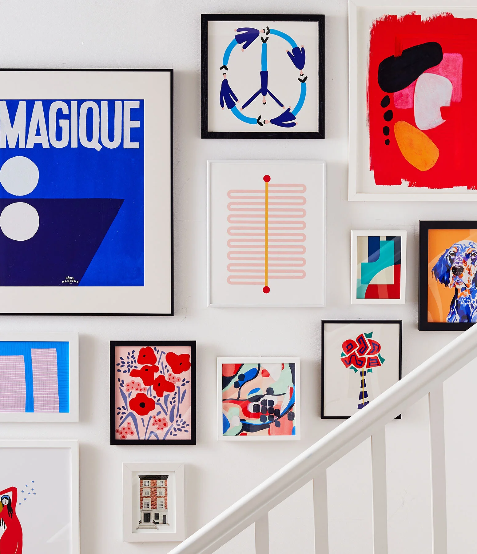
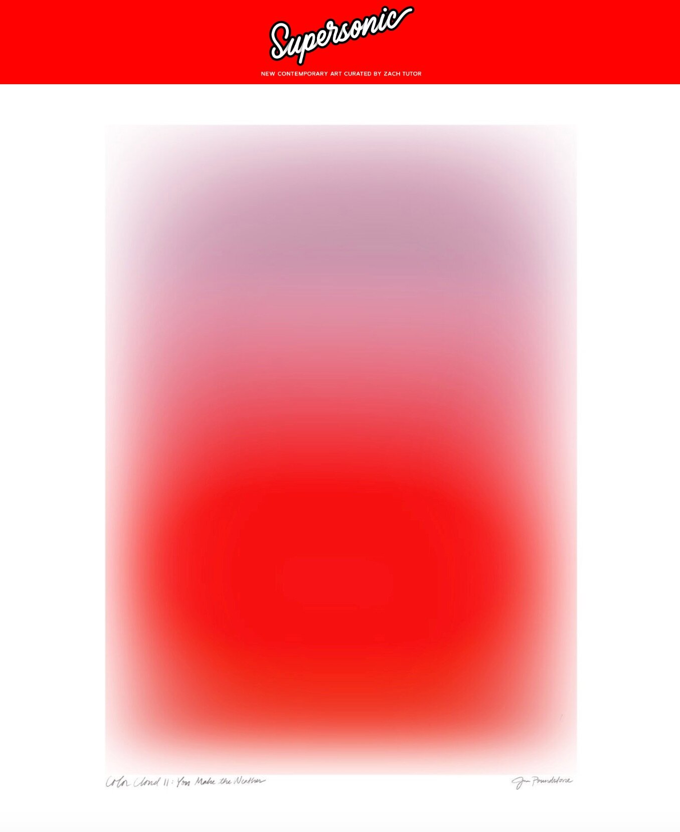
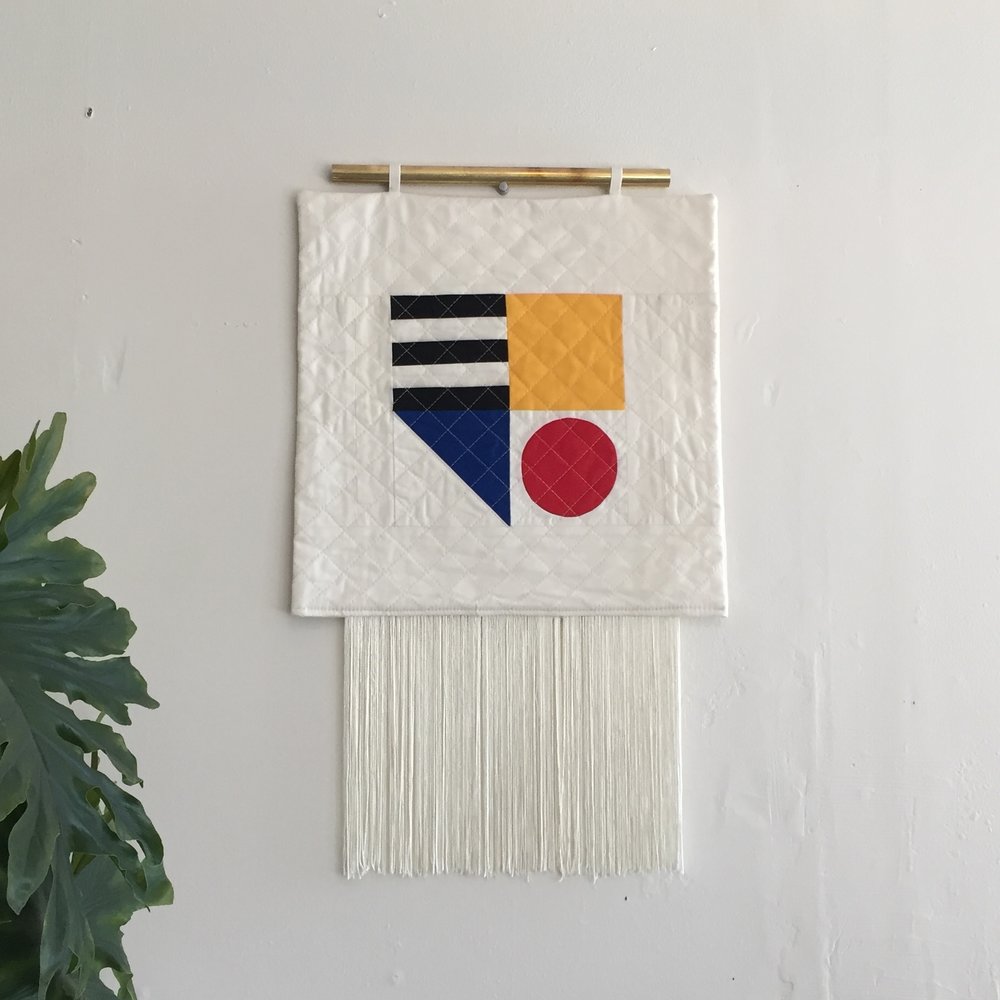
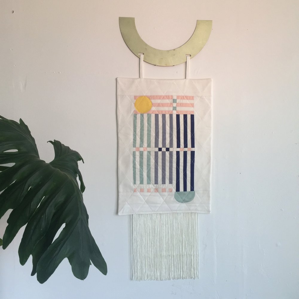
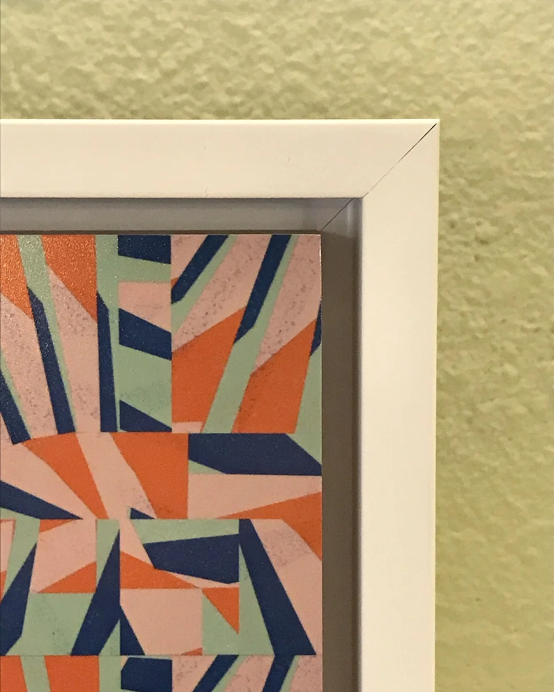
Pieces from Jennifer Neil's portfolio on her website.

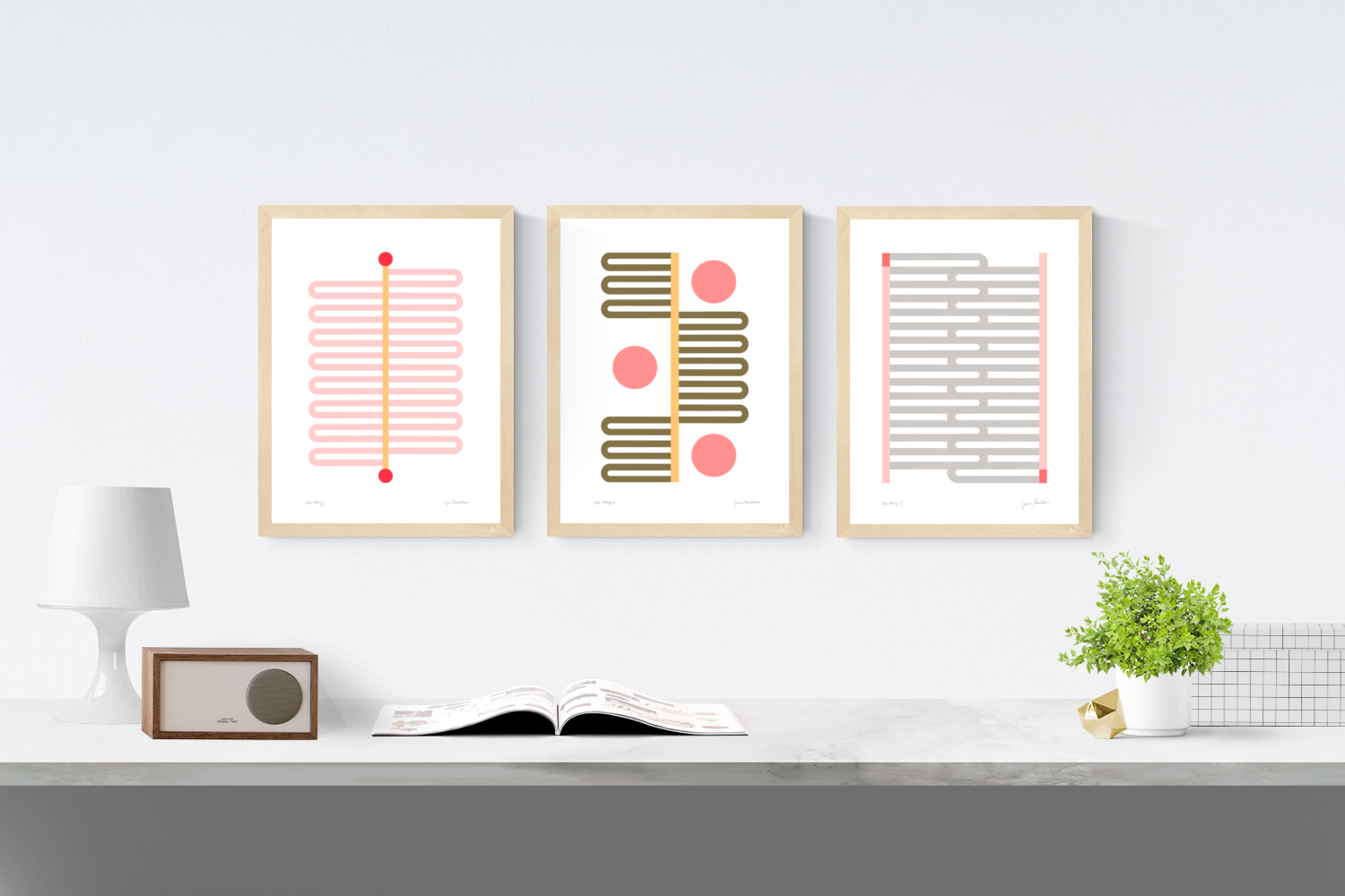
I’m currently on my third series of work and much to my dismay I’ve been pulled into a rainbow palette. I think after doing neutrals for so many months I’ve been starved for color so the transition was probably inevitable but I’m still trying to come to terms with so many colors. I haven’t quite gotten a good grasp on it yet but I’m having fun re-finding my voice in this new chaotic chapter.  

What do you do when you’re just not feelin’ it - whether it’s getting stuck on a particular piece you’re working on, or just in general?

I have two things that I do when I’m in a creative drought. Usually, I do what I call an “easy win” which is when you design something that’s easy to finish but the end result looks really great. Just the act of finishing a small project always reminds me of how good it feels to complete a piece and usually gives me the energy to tackle whatever it is that I’m avoiding.

And if I’m really stuck, I try to find my happy place by doing an improv piece or I “treat myself” by learning something new like trying to sew a shirt or a swimsuit; just anything that will make me feel a sense of accomplishment. That’s really the driving factor for me; feeling like I’ve accomplished something.

If you had a chance to magically become super-proficient in another artistic medium overnight, what would you choose?

Probably metal or wood. I’ve always wanted to design jewelry or furniture and I wish I was the type of person who could have a side hobby but I’m unable to “dabble” in things. If I were to take a woodworking or metal smithing class I would completely abandon sewing and jump head first into that new hobby.

You mention on your website that you want to elevate the art of quilting - that it’s been overlooked because “it has mostly been used by women out of their homes.” Can you say more about that?

What I mean by “elevate” is that I want people to start seeing the medium of quilting on the same level as painting and sculpture. Right now, quilting is seen as a craft or a woman’s hobby while being a painter or sculptor is considered prestigious. The medium of quilting hasn’t been taken seriously because throughout history women have not been taken seriously. I believe that if women had been treated as equals we would see textiles (i.e. quilting, weaving, embroidery, etc) right next to paintings, in museums across the world.

Hannah Hill, who’s an embroider, made a piece of work about textiles not being taken seriously that really sums up my feelings on the matter: here it is.

"The medium of quilting hasn’t been taken seriously because...women have not been taken seriously. I believe that if women had been treated as equals we would see textiles right next to paintings in museums across the world."

Tell us about one of the visual artists that’s meant meant the most to you, and why?

There’s a contemporary artist that I found on Instagram named Gina Gimenez and she has a piece that inspired my first primary quilt design so I contribute my artistic birth to her. She has a lot of abstract geometric designs that really speak to me.

What’s something you wish everyone understood about your work that’s sometimes hard to convey?

This was the hardest question to answer because my work is purely aesthetic, there’s no hidden meaning behind the pieces, so it’s only real intention is to provide joy and inspiration. I find real joy in seeing my visions come to life and when people see my pieces I hope it makes them feel inspired and happy.

"I find real joy in seeing my visions come to life and when people see my pieces I hope it makes them feel inspired and happy."

Who or what can make you laugh really, really hard?

My friends and family. I grew up in a household with a really wild sense of humor. It’s how we communicated with each other so my sense of humor is all over the place from Eric Andre Show to The Office. I also go through phases with Youtube videos where one video will make me laugh for months on end. Right now my favorite video is a Tim and Eric video called Quilting with Will it just kills me.

What art is hanging up in your house?

Sadly, not much. I currently only have 3 spaces where I can hang up work and right now they’re occupied by strange goodwill finds. Although, I’m dying to redecorate my apartment so hopefully I’ll get some new pieces (that are actually meaningful) very soon.

What does success look like for you as an artist? How are you defining it for yourself at this moment in time?

The funny thing about success is it’s never truly attainable. You achieve one version of success and then the goal post just moves. Right now, I’m pretty happy where I’m at; I’m regularly being contacted for shows, I’m selling pieces on a consistent basis, and I managed to get a job in the textile industry (I’m a sewer at a small leather bag company). So right now, I’m living in my own version of success.

But moving forward, I’d like to start seperating my work. Right now, Ersa Fibers is kind of straddling the craft world and art world. Eventually I’d like to create another account strictly for craft projects and keep the Ersa Fibers Account for my artwork and change the handle to my full name. I’d also like to release a line of full size quilt patterns and video tutorials with the hopes that I will eventually start getting some freelance projects.

Long answer short, my current version of success is producing higher end pieces under my own name and freelancing.  


Thanks again to Jenn for taking the time to share her thoughts here. I'm so excited to watch her work evolve!

My Work Highlighted On Chairish Trends Feature!

Last year I was incredibly excited and honored to get a note out of the blue inviting me to be part of the Chairish Artist Collective, a wonderful group of artists making amazing pictures. 

Since then, Chairish has integrated art and artists more and more into their site, in addition to the fantabulous kaleidoscope of vintage furniture and home accessories. You can seriously go down the rabbit hole over there. And I have. #noregrets

Anyhoo, in the last couple of weeks my work's been featured in a few curator-led collections  including one on Essential Trends for Spring, which features Pink & Acid Yellow [Color Space Series], Red & Orange Squares in Squares and Color Structure 2. Color Structure 4 image also got a shout-out as one of the 99 Things We Love for Spring collection. Feels good to feel the love :)

Head over and check out all the cool stuff on Chairish. (Hot tip: One of the features of the site I really love is the ability to filter results by city so you can shop local: I offer free local pickup if you're in or near Portland!)

Now_Starring__Out_With_The_Old______Chairish_and__CMP-4367__Website_Updates_for_Orchestration_Launch_-_Jira_png.png

Adventures in Printing...

I'm the midst of trying out a few new ways of printing my images to see which ones I like. The latest experiment is printing on a bamboo block by Plywerk - it's feeling pretty good.

Jessica-poundstone-plywork.JPG

The substrate is sustainable bamboo (love that) floated in a custom cut frame. It's ready to hang, or just set on a shelf, mantel, desk, etc. The outside edges of the frame measure just over 6"; the image inside is 5" x 5” and everything is archival. 

plywerk-color-structure-6-jessica-poundstone-closeup.JPG
Ready to hang - woo hoo! 

Ready to hang - woo hoo! 

If you’re interested in snapping this up (it’s the only one that exists at the moment!) shoot me a note! It's $85 with free shipping anywhere in the US (or we can arrange pickup if you’re in the Portland area).

And feel free to shoot me a note if you’d like a different picture of mine in this format - with or without the frame - happy to arrange! 

Oh and extra shoutout to Chet and Dot for the wooly flowers - I picked these up at the da Vinci Arts Fair this year, and they literally make everything better.

A Q & A To Kick Things Off

Hello hello, and welcome to this little corner of the web where I'll be.....well, I don't know what I'll be doing up in here, exactly, but I'm going to give myself some space and time to figure it out. 

I'm going to start with a little Q&A because it's too hard to figure out what tell y'all about myself without it. I cherry picked some questions from the appropriately-titled Forbes article 55 Best Questions To Ask To Break The Ice And Really Get To Know Someone. So here goes - me answering 5 questions for you.

1) What was the worst job you've ever had?

In high school, someone thought it would be a great idea for me to take over from another girl who was cleaning house for a rather frail elderly woman who lived in our neighborhood. I wanted extra cash, and I did not love babysitting, so I was willing to give it a try. The woman was very sweet. However, she had a colostomy bag. (If you don't know what that is, Google with great trepidation. I have never Googled it, so I don't know for sure exactly the deal, but I believe that a fair description would be a bag outside your body that captures poo from inside your body because your colon's not working properly. Yipes.) One day, while I was cleaning her bathroom, I heard her tiny, sweet voice from the kitchen saying, "Uh-oh." I went in to see what had happened. You may have already guessed - and you're right. Her colostomy bag had broken all over the kitchen floor. I did clean it up like a trooper. But I could never go back there again. And sadly, I still vividly remember the truly paralyzing smell. Not good.

2) What’s the first career you dreamed of having as a kid?

I remember having absolutely no idea what I wanted to do when I was a kid - but then getting an assignment in like third grade to write about what I wanted to do. How I arrived at the idea of writing about a career as a dental hygienist is absolutely beyond me. I did not know any dental hygienists. At all. I think I was supposed to do research about it, and maybe talk to a dental hygienist as part of the assignment? I can't really remember, but suffice it to say, that assignment was both the beginning and the end of my entertaining a career involving looking at the insides of people's mouths. (Although later in high school, strangely, I did end up working in a periodontist's office - again, don't Google it unless you want to see some truly distressing pictures of the effects of gum disease - doing dictation. Occasionally I'd have to look at charts to reference something. One day I opened a chart and an old dead tooth fell out. Ew.)

3) What's your favorite 90’s show?

Tough call, but the one that immediately springs to mind is Northern Exposure. (Mad About You and Twin Peaks are up there.) It had what is still my favorite mix of things in any show: goofy, absurdist humor, wicked smart dialogue, flawed, human characters and then - every once in a while - whips around on you to deliver a moment that's so beautiful and full of meaning, you're not quite sure what hit you. Northern Exposure was on during my high school years, and I had a whole ritual for watching it. I'd get all ready for bed, turn out the lights and get under the covers. (Yes, my parents let me have a tv in my room. #lucky) I'd watch the entire show, muting all the commercials so they didn't sully the experience. Then, at the very second the last credit rolled and the end-credit song ended, I'd quickly shut off the tv, turn over and try to go to sleep as fast as possible to keep the feeling of the show with me as long as possible. #notweird

4) What are you reading currently?

I'm always reading a bunch of different things. At the moment, what's in the teetering tower on my nightstand...huh a lot of stuff. I'll just pick the three at the top of the heap:

9780812997576.jpg

Sick in the Head - Judd Apatow's collection of interviews with comedians. Loving it. 

9781937006341.jpg

Mindfulness Survival Kit by Thich Nhat Hanh - learning more about meditation and contemplative practices. Good stuff.

9781250064462.jpg

The Sound of Music Story by Tom Santopietro. My son found this on the shelf at the library, and, since we've all been mildly obsessed with how good The Sound of Music (the movie) is since we re-watched it on Christmas Day (seriously it is so freaking good), Henry and I thought we'd give it a go. I'm reading it out loud to him. It is an extremely strange book so far, but not boring, so we'll keep going for a while.

5) What’s your hidden talent?

I can whistle and hum at the same time, in harmony. Is that a thing other people can do? I just realized I have no idea. Try it and let me know. Thinking about it, you know, I try to keep my talents on display, for the most part; I'm not sure what good hiding them does? Although the humming and whistling thing...maybe that's best left hidden, just because honestly it doesn't really sound that great. 

Okay, we made it through this Q&A, and  my first post here! That was pretty fun, if a bit one-sided. I'd love to hear from you - maybe with answers to these five questions - or answers to other questions of your choosing, or feel free to ask me other questions of your choosing, etc. etc. Comment away below!

Until next time! 

-JP