The amazing humans over at Rare Device just re-launched their website, and you should most definitely check it out. It made me remember the amazing interview Kayla Conyer did with me there earlier this year - I wanted to add the full text here as well, because I loved her questions, and I hope the answers will be interesting to you as well, whoever you are ;) Here’s a link to the original version on the Rare Device site.
Inspired by feelings and concepts, the work of Jessica Poundstone has captivated the Rare Device staff. Jessica’s color block prints evoke the spirit of well-known artists like Mark Rothko or Josef Albers. Based in Portland, Oregon, Jessica began creating digital artwork over the last few years using only her hands and an iPad. Without any formal art training, her part-time practice is increasingly becoming a bigger part of her life. We talked to Jessica about where she finds inspiration, how she finds time to create art, and how color plays a large role in all of her pieces.

KC: How long have you been creating art and what is your background? At what point did you decide that making art and putting it out into the world is something you wanted to pursue?
JP: I started making art when I was a kid and never really stopped. I didn’t go to art school — I got a degree in Humanities with a minor in writing and have worked in communications ever since. But I’ve always spent a pretty significant amount of my time looking at, thinking about, and making pictures.
It was about two years ago that something shifted for me in terms of my art: I wanted to publish the pictures I was making and felt a strong urge to just go for it. It felt less like a decision and more like a compulsion, honestly. So I started an Instagram account and just went for it. I can’t even tell you how encouraging those very first likes and comments were! The intensity of my drive to make and put my work out there hasn’t diminished much since then. I am still so energized by creating new work and exploring new ways of thinking visually.
KC: Your work is mainly digital, but so many of your pieces remind me of paintings. How did you decide to stick with digital media over more traditional practices?
JP: Over the years, I’ve tried out a lot of different mediums. Pencil, charcoal, watercolor, acrylics, gouache, screen printing, ceramics: you name it, I’ve probably tried it. But none of the mediums I explored felt like “home” to me. I had messed around with making images on my phone in the painting app Brushes (much like a simplified Adobe Illustrator, it’s a blank-canvas painting app) for a while. But I hadn’t thought of it as a primary medium I could work in until I read that David Hockney had been making work on his phone and later on his iPad (also in the Brushes app). Just hearing him say how much he liked it — and then seeing pictures of a museum show of his where they displayed his iPad images on large LCD screens — made it an intriguing possibility I felt liberated to explore.
Over several months, I experimented with making images on my phone — often during my bus ride to and from work. I created a few different techniques and processes for making minimalist pictures that I absolutely loved. The images felt like a pure expression of things I wanted to say; it felt like I had finally found my voice.
Very quickly, though, I realized that I needed to know how these images would look in print. If they were not successful I’d need to figure out a way of working them in analog because I was now committed to the style I’d developed. I did a ton of research, found a local giclée printer and sent off some files. I was absolutely overjoyed when the test prints came back looking exactly like they looked on my screen. That’s when I knew for sure that I could continue working in digital.
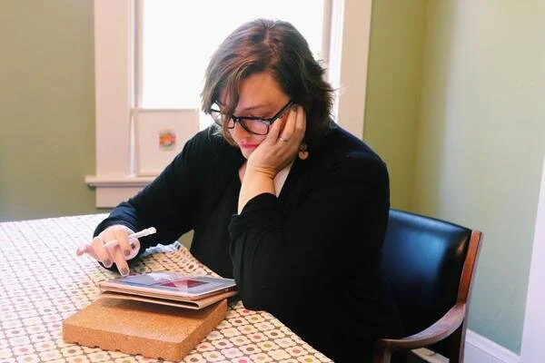
Me at my dining room table….er, I mean studio :)
KC: What is your practice like? Do you work as a full-time artist, or is creating art something you find yourself having to make time for?
JP: I have a pretty demanding full-time job, as well as family life and social life to tend to, so...yeah it’s a balancing act. There are days I find myself wishing I could work on art full time — on other days I’m glad it still feels like I’m “stealing time” to make art because that dynamic creates a certain joyful/focused energy that makes it into the work. I’ve always been a night person, so I’m often working on my art after everyone else in my family has gone to bed, between 10 p.m. and 1 a.m.
KC: What is your process for developing your work? Do you start with color, pattern, or nothing at all?
JP: I have a lot of different starting points because I am constantly getting excited by things I encounter (an article I read, artwork I see, a building I drive by, etc. etc.) and generally have way more ideas than time to execute them! Sometimes I start with a color or a color combination; other times it’s something I’ve heard or seen, or there’s a feeling or concept I want to explore. No matter the starting point, I try to let the work lead me wherever it wants to go. That’s one of the many ways digital is so freeing — I can try anything with an image and never have to worry about finding a space to work or spending money on materials. I didn’t realize how much those two factors limited my process until I no longer had to worry about them.

KC: With the exception of a few pieces that are nature-based, most of your work is very abstract. Are these forms based on real items, places, and scenarios, or are they spontaneously drawn from the unconscious?
JP: It was a big shift — and a big relief — to step away from making representational work. And yes, most of my work is coming from the unconscious and is done in “flow” — as in the Mihály Csíkszentmihályi definition of it: that state where you’re completely absorbed in and energized by the work you’re doing because you’re being challenged at the top of your ability. It’s an incredibly exciting feeling.
KC: Color is obviously a point of interest for you. What are you looking for in the connection of multiple colors on a surface? Do you want to evoke a feeling? Spark interest?
JP: Color is just such a huge gift and a mystery. It’s very much like music to me. I’m still wowed by it all the time. At the heart of it, I think what I’m trying to create with these images are beautiful, meditative spaces people can have and hold in their minds. I want them to be both a catalyst and a comfort — a way of helping people break out of habitual thought patterns, inspiring new possibilities, new ideas and new ways of thinking and feeling.
KC: Are there certain color combinations that you find yourself going back to time and time again? Do they have any personal relevance to you?
JP: I was recently cataloging my work and realized I definitely do have some colors I go back to again and again — although I couldn’t really say why, or whether there’s personal relevance there. The main one is a soft, slightly orangey pink — I’ve been really close to that color for many years, and I see that I pair it with midnight blue, egg yolk yellow and bright tomato red in a recurring way.

Color Space 3
KC: Do you have any projects or “dream pieces” that you’re hoping to work on/create in 2019?
JP: A crazy dream I’ve had for a long time (who knows, maybe this is the year!) is to make a light bath — a portable chamber people could step into and be in for a while to really experience a certain color or colors. In my vision, I’d buy time in various parking spots around town and people could come and just be engulfed by the color of their choice for a chunk of time. Doesn’t that sound great? If you can help make that happen, get in touch :) A more practical “dream” is to explore some surface design applications for my work — I have so many ideas for patterns! — and possibly make some work that’s really, really big.